
Rebranding BGB Group
ROLE
Concept
Art Direction
Graphic Design
This was a rebrand for a pharmaceutical marketing agency, which had started out with a barebones logotype. With the agency growing and expanding capabilities, the key task was to anticipate usage and play up the core competency of BGB Group: an unparalleled and robust in-house medical science staff with capabilities that differentiate their strategic work from other agencies.
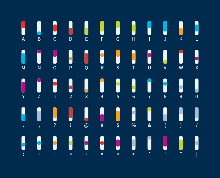
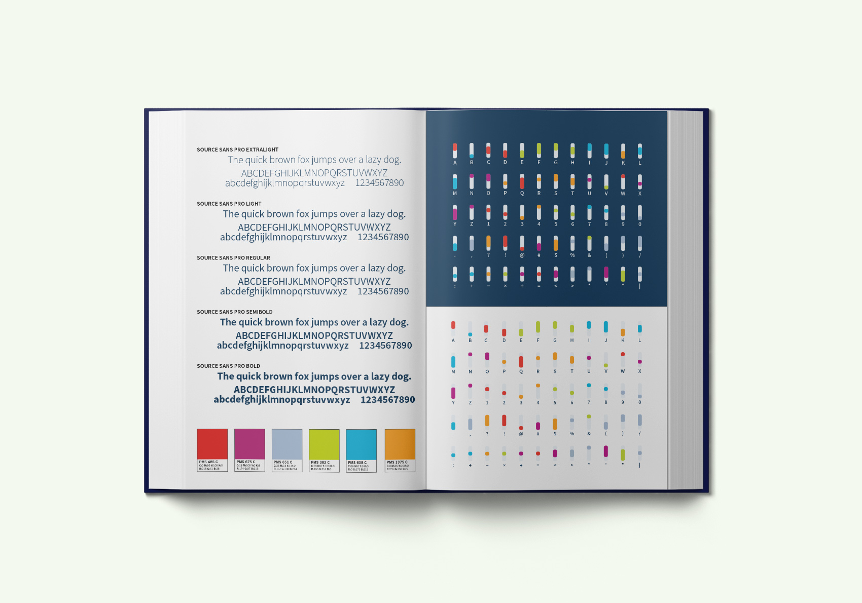
The objective was to produce a system with numerous practical uses, but still keep things interesting. In a straightforward solution, I combined medical iconography with a colored "pill" alphabet system to produce a "code".The design would eventually travel out of of standard usage and into everything from stationery to wayfinding signs and name tags.
